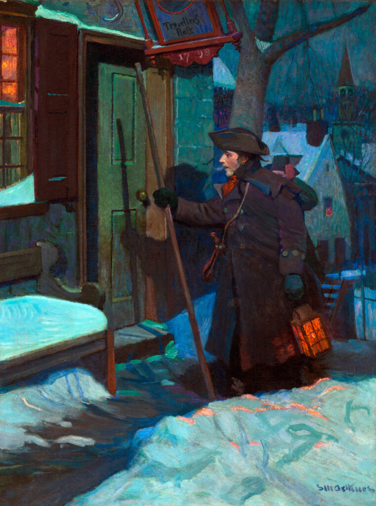
On a moonlit wintry night, a young man approaches the weathered door of an inn as his glowing lantern scatters reflections on the snow. A biting wind buffets his collar and the overhead sign. The inn’s name, Traveler’s Rest, and its candlelit windows promise sustenance and companionship. The house beyond, too, radiates warmth and safety. A red scarf draws our eyes to the man’s open mouth and reveals his purpose: he is a night watchman—probably a rotating volunteer—stopping to call out the time and weather on his rounds. The rattle slung over his shoulder is for emergencies. Its clatter will alert townspeople to suspicious characters, fire, crimes, or other threats, and rouse all within hearing to come and help him confront the danger. His firmly-grasped walking stick provides not just secure footing but ready self-defense in an era before towns had police forces.
A century ago, publishers such as Brown and Bigelow commissioned leading illustrators, including historical specialist Stanley Arthurs, to create images for promotional items. Free calendars had the advantage of keeping a business’s name on walls in homes and offices for a year. Most calendars had one image with a pad of tear-off monthly sheets. The subject matter had to be easily recognizable and both visually and emotionally satisfying to a broad segment of Americans nationwide. Historical scenes, real and imagined, were popular.
In 1928, many viewers—even without noticing 1798 on the inn’s sign—would have recognized the white house and church steeple as the setting of an 18th or early-19th century New England town. Suffused with the blue shades of the night sky, the painting is a reminder of both the comforts and vulnerabilities of the early Republic.
The 1920s were the height of the Colonial Revival, when nostalgia for an idyllic past pervaded popular culture from patriotism and morality to literary tastes and architectural styles. The colonial and early national periods were idealized as a time of individual heroism and community cooperation. Exhausted by the losses of World War I and the 1918 influenza epidemic, many people were also apprehensive about social changes. Unmoored by increasing industrialization, advancements by Black Americans and women, and the perceived secularism of flappers and speakeasies, they would have responded to a scene of reassuring and predictable days. Others—perhaps aware of historical realities different from Arthurs’ imaginary portrayal—might have simply enjoyed a glance at a luminous evening in an old, picturesque village.
In December, 1923, editor A. W. Rushmore of Harper and Brothers offered illustrator Frank Schoonover a commission: “We are working on another title…and have chosen Hans Brinker or the Silver Skates… Will you please read it over, and cook up a stunning color picture for the wrapper…(and) the colored frontispiece.” According to Schoonover’s archive, he sent the finished work to the publishers on February 13, 1924.
His painting depicts 15-year-old Hans Brinker in a speed skating race on an Amsterdam canal. Mary Mapes Dodge’s novel about 19th century Holland centers on Hans, the resourceful son of a poor family. He earns enough money to buy steel skates, so that he and his 12-year-old sister Gretel can enter a race to win the “perfectly magnificent” silver ones. Gretel is the girls’ winner. Near the end of his successful race, Hans withdraws and allows another boy to win, one who—unlike many of the Brinkers’ well-off neighbors—had been kind to him in the past. Hans’s gesture makes clear his generosity and integrity. The story is full of sub-plots, coincidences, and reflections of mid-19th century American ideas about Dutch history and customs.
The cover’s brilliant colors, as well as inventive composition, draw us into the picture, and we feel like spectators along the canal side. Hans glides by, the sharp edges of his frayed green scarf flying, and his trousers a rough patchwork of patterns. His ungloved hands remind us of his poverty. He skates straight ahead with effortless grace. In contrast, his nearest competitor, well-dressed and with a gloved hand silhouetted against a canal boat mooring, skates awkwardly with his arms flying, head at an ungainly angle, and slightly off-course.
Schoonover’s illustration mirrors Mapes Dodge’s spirited description of Amsterdam on a race day. Onlookers were dazzled by “… (A) confusion of bright colors, (and) ceaseless motion… (as) a bright medley of costumes flitted by. (I)t looked from a distance as though the ice had suddenly thawed and some gay tulip bed(s) were floating along… in picturesque attire…”
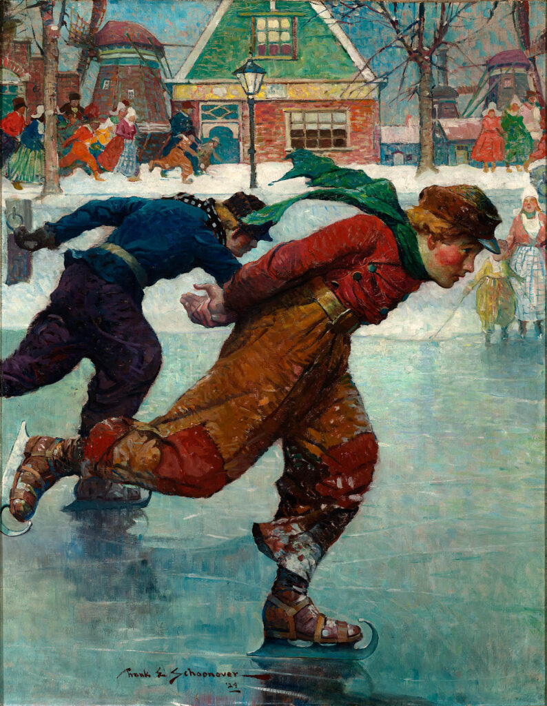
He blurs the spectators’ faces as they observe or try to keep pace with the skaters. He concentrates instead on a kaleidoscope of intense colors, stripes, plaids, and patterns. Mapes Dodge’s descriptions of Dutch costumes mention black several times, but Schoonover hardly includes it, except for men’s hats. For contrast, he uses white highlights. White women’s caps. White snow on tree branches. Skaters skimming the “glassy plain,” its blue depth emphasized by the white of fallen snow on the opposite bank.
Schoonover crops the top of the Dutch gambrel roof on the multi-colored house on the far side of the canal. He places windmills, one with decorative bands of color, smaller blue buildings, and a brick stepped archway nearby. These discourage our eyes from wandering into the distance and keep Hans front and center.
Schoonover’s “stunning” color picture may have exceeded his editor’s—and his young readers’—expectations. It certainly would have pleased Schoonover’s teacher, master illustrator Howard Pyle, for whom such art ensured that “The stories of childhood leave an indelible impression, and their author always has a niche in the temple of memory from which the image is never cast out.”
Delaware Art Museum: delart.org




Leave a Comment